Level Design: Readability
During the level design process, I try to put a lot of emphasis on “readability.”
For me, readability comes down to: what information is the level conveying. Not all information is intended – sometimes the environment, lighting, layout, etc, will convey something the designer did not intend.
To be clear, I think unintended information is fine! I am a big believer in happy accidents. It’s one of my favorite things about game development.
Regardless, I feel it’s helpful to be aware of what the level is and isn’t saying. Here’s some thoughts on level design readability.
Context: this is largely about first-person & third-person games.
Wiggling the camera
Ultimately, the player is the camera person. The player controls where the camera is located and what angle it faces.
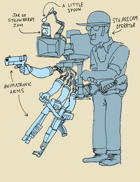
First-person Secrets, Brendon Chung, 2014
The player controls what they look at. But the level designer controls what there is to see.
So, a large amount of my time is spent asking: from a given point in the level, what can I see?
- Is there a prop that blocks my line of sight to the hallway?
- Does the oblique angle of that door make it almost invisible to the eye?
In practice, this results in me wiggling the camera. I’ll enter an area and see what I can see, wiggling the player around. I spend so much time wiggling…

To summarize: when you stand at a given spot…
- what is behind the decision to make level element XYZ visible?
- what is behind the decision to make level element XYZ hidden/obscured?
As a level layout becomes more complex (and perhaps populated with things that can no longer be changed for time/budget reasons), sometimes these decisions become unintended. That’s fine – I find it helpful to at least be aware of the decision’s existence.
This is largely why I spend so much time wiggling.
👀Example: 007 First Light
A nice bit of playfulness with player line-of-sight in IOI Interactive’s James Bond game:
https://bsky.app/profile/blendogames.bsky.social/post/3monwmxv4n22a
Ambiguities I
Let’s take another look at the image above:
So… is that a dead end? What’s going on there? Who knows.
All I know is that I’m wiggling around and it sort of looks like a dead end… but also sort of like a hallway…?
Some layouts can result in unclear spaces. Perhaps you intentionally want it to be ambiguous. Perhaps you don’t.
SPOILERS: it’s a hallway (that is difficult to see). Here’s how it looks from above:
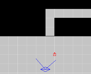
I find it helpful to take the perspective of “fresh eyes.” Pretend you’re a new player. Imagine the millions of ways you’ll interpret and misinterpret the level layout.
👀Example: Thirty Flights of Loving
Here is a final version of a passageway from my game Thirty Flights of Loving:
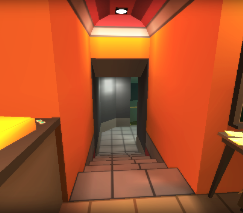
Earlier iterations of this passage looked pretty similar to the above images of the blue hallway – ambiguous and difficult to read its intention.
Work was done to make this passage more clear. Some things to notice:
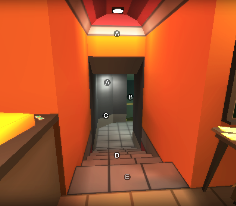
A. Light to draw the player’s eye.
B. Cutaway that gives line of sight to the adjoining area.
C. Angled corner to clarify this is a hallway elbow turn.
D. Elevation change to communicate the boundary of a separate area.
E. Texture change to communicate the boundary of a separate area.
Do you need to do all of this stuff? No! Every layout has different needs. Part of the fun of level design is feeling out what works where.
Ambiguities II
Another common ambiguity is: can I traverse that?
QUESTION: which gaps here are wide enough for the player to slip through?
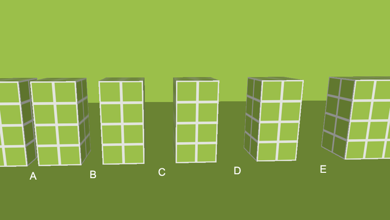
ANSWER: do you want the player to be asking this question? Is “guess which passage is wide enough for me fit through” an intended challenge in your game?
Something I think about is:
- There are challenges we design for the player to encounter.
- And, there are challenges we unintentionally/accidentally create.
Our game Skin Deep is a stealth-action game. The game puts a lot of decisionmaking on the player’s plate. So, we had to pick and choose what challenges to intentionally not include, in order to make a more focused experience.
👀Example: Skin Deep metrics
One way we approached this is metrics. This is an example of our Skin Deep metrics document:
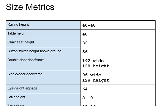
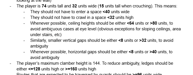
(If you have Skin Deep, you can play the free ‘Mod Museum’ behind-the-scenes level that has a section about our metrics)
Basically: we didn’t want traversal to be a guessing game. Instead, we wanted traversal to be intuitive and straightforward – you enter an area and can (ideally) instantly identify what is climbable, what areas you can fit into, what are the exits, etc.
To achieve this, we agreed on a set of consistent metrics.
Ambiguities III
In addition to standardized metrics/sizes, we also had a short list of “forbidden architecture.” These are specific architectural layouts that were fundamentally ambiguous.
👀Example: Sloped Wall
This was forbidden:
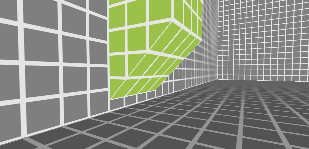
Forbidden…
This was forbidden because it was ambiguous where the player did/didn’t have standing-height clearance.
QUESTION: if these 3 Ninas ran forward, which Ninas would have adequate clearance and which Ninas would clonk their faces into the sloped wall?
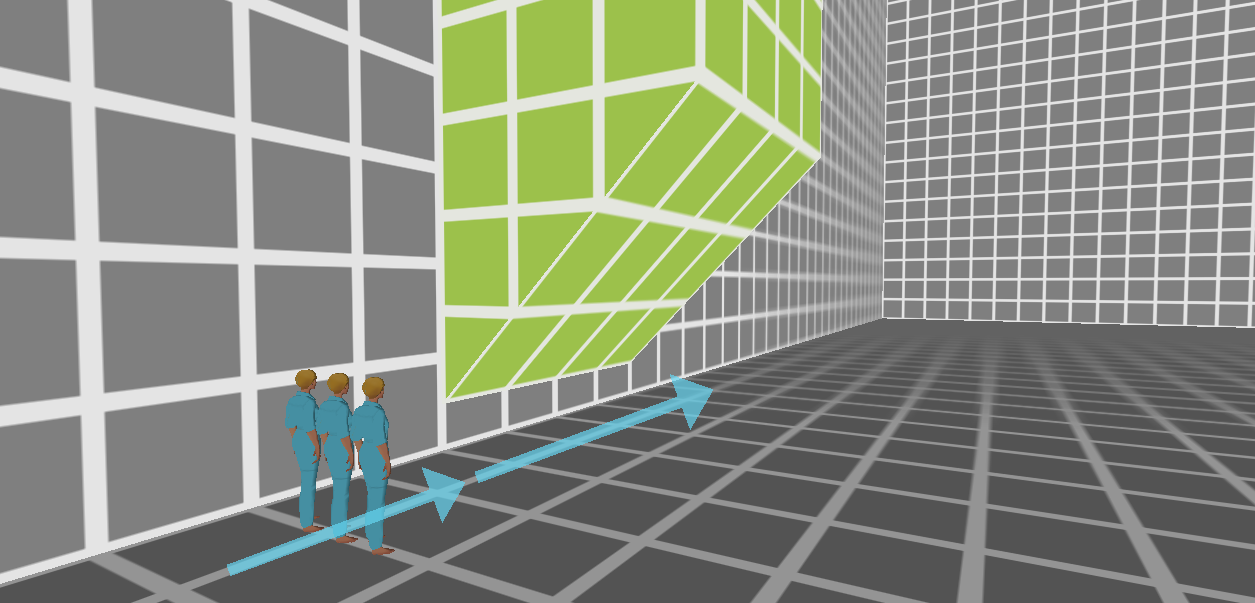 3 Ninas running forward
QUESTION: if these 3 crawling Ninas tried to stand up, which Ninas would have adequate clearance to stand up and which Ninas would clonk their brains on the sloped wall?
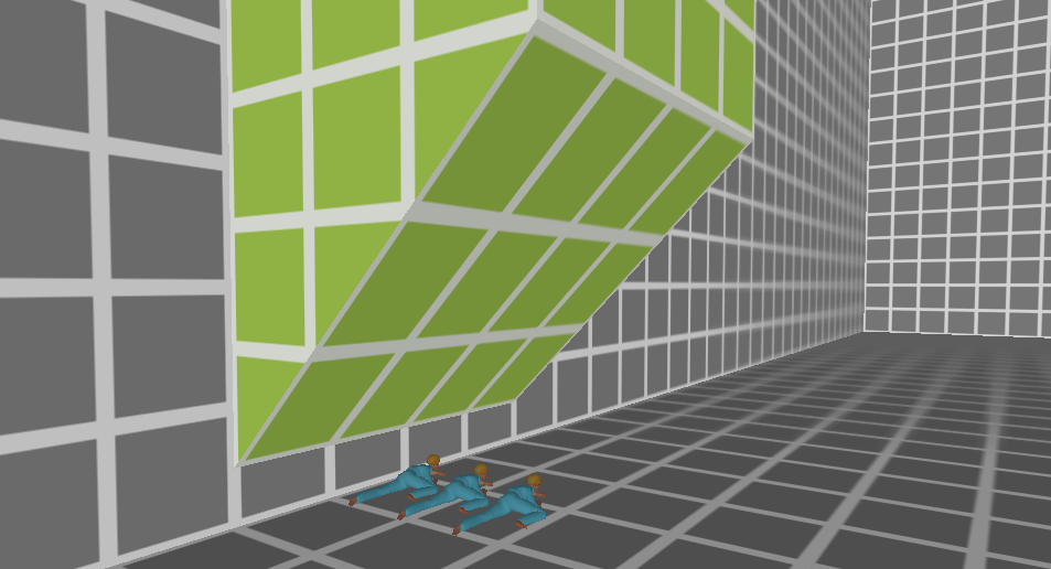 3 crouched Ninas attempting to stand up
ANSWER: it’s ambiguous. And so, we just avoided this kind of geometry.
Generally speaking, environments were looked at from the worst-case scenario: having to negotiate this kind of geometry during the heat of combat, getting stuck/blocked here, and being confused as bullets are whizzing by.
Instead of simply nixing this completely, is there a design solution that would allow us to retain this beautiful architectural element? Probably! Is there time/budget to spend on that solution? Shrug emoji! 🤷 That’s up to you, and it’s not always an easy decision.
Art Density
I wrote about art density in a previous post so I won’t talk too much about it here – but basically, if your goal is to guide the player or highlight things in the world, it is sometimes beneficial to strategically decrease the density of art in the world.
Team Fortress 2 utilizes this well:
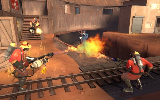
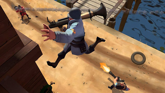
Big shapes, muted/flat textures, big difference in detail between character complexity and environment complexity. It works great at filtering in information you need & filtering out information you don’t need.
Choice Density
Similar to art density, the density of choices also affects readability. For example: if you enter a space and immediately encounter 5 separate exits/doorways, it’s a lot for the player to parse and keep track of.
In Skin Deep, we wanted the player to gain mastery of the environment. We limited how densely packed the exits/entrances were, in an effort to make the level layouts easier for the player to map out in their heads.
Squint Test
This is mentioned in my writeup about art density, but it can sometimes help to “squint” at a space. This helps give a rough idea of where the eye is drawn to, how busy the space is, etc.
One way of visualizing it:
- Take a screenshot.
- Turn it black and white.
- Blur the image.
Here’s a couple examples from Quadrilateral Cowboy:
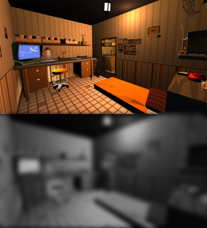 Eye is drawn all over the place, lots of points of interest, no one singular point of focus.
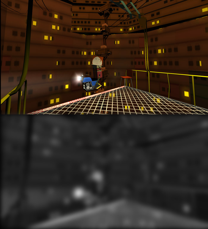 Not busy, eye is drawn to basically just one part of the screen.
Playtesting
There are so many different angles to view a level. No matter how much you wiggle the camera, no matter how good you are at emulating “fresh eyes”, you’re still only seeing a limited perspective.
I find playtests to be the only surefire way to verify whether something reads or not. You need other human beings! Yes it’s embarrassing to show stuff that’s busted! I know!!!!!
Et al
This is not a comprehensive list, but these are some things I think about when working on levels.
I do firmly believe, however, there is no one “correct” way to do level design. There is no platonic ideal of “objectively good” level design. You just gotta listen to what the game wants.
Credit to Skin Deep’s amazing co-designers Suzanne Will and Tynan Wales for being incredible collaborators. The game wouldn’t exist without you 🙏
To view all posts in this series, click here.